


Scape
An App for Eco-Friendly Travel
The ever-increasing environmental pollution in India is caused by overpopulation, rapid urbanization and largely, by tourism. The challenge is to sensitize the young generation to eco-conscious travelling by creating a delightful experience that will influence their long-term behavior as travelers, wherever they may go.
I used design thinking to create Scape- a partnership between the planet, people & profit. The guiding factor was sustainable tourism- a great experience for travelers, a better way of life for the locals, and the least amount of negative impact on the environment- a better future for all.
role
Lead Designer
duration
6 months
processes
Research and define scope for MVP, Information architecture, Wireframing, Visual Design, User testing
tools
Adobe XD, InVision, Marvel, Miro, Adobe Illustrator
The User
The future of travel has taken a sharp turn towards natural and authentic experiences such as sustainable travel and local over international travel, away from the fancy hotels and guided tours that we were used to. That, combined with the fact that today’s youth is quite aware of climate change and has grown up being surrounded by international dialogue about climate change created the user base for Scape.
New-gen travelers (Ages 18 - 40) who indulge in short-term travel more than five times a year and/or long-term travel for over one month a year are the major constituents of this user base and are likely to try Scape at least once because of their inclination towards environmental consciousness.
Design Thinking
Here's a systematic summary of all the UX processes used.
Secondary Research, Screener survey, User interviews, Expert interviews
Empathize
Define
Affinity maps, Empathy maps, Personas, Problem statements
Ideate
User stories, Brainstorming, Sitemap, User flows, Competitor analysis
Prototype
Sketches, Wireframes, High Fidelity Designs, Iterations
Test
Guerilla usability testing, Remote moderated usability testing
Empathize
Research Methods
With a combination of qualitative and quantitative research, I studied the scope for sustainable tourism, the role of eco-friendly practices in travel and the preferences of our user group.
Secondary Research
Compiling field relevant information through verified articles and research papers
Defined relevant terms such as eco-tourism and sustainable tourism, studied the eco-tourism policies in the state of Sikkim and the impact it had on the community and looked up existing products in the domain.
User Interviews
30 minute, one-on-one video interviews with five users after a screener survey
I screened over 25 participants to shortlist 5 people for the user interviews. I ensured that they were regular travelers and that they recognized environmental pollution as an immediate threat caused by tourism in India.
Expert Interviews
30 minute, one-on-one video interviews with five users after a screener survey
The experts helped me with distinct, well-researched points of view that can lead to real-time progress. They pointed out how the market will eventually evolve to accept eco-friendly products and how we can make people more receptive to the idea.
User Responses
Numbers Don't Lie
80%
of users believed that climate change is the defining issue of our time and that we are at a defining moment.
85%
of users used their smartphones for travel purposes (GPS, booking transport and accommodation, photography, keeping in touch with home and travel research)
26%
of users identified environmental pollution as the biggest problem with tourism in India, and another 27% said it was the lack of proper infrastructure.
Expert Quotes
“We prefer evolved travelers, those who are open to being sensitized about our world and reduce the effort of hospitality.”
- Rachel Ravi, Managing Director at Red Earth Good Living and Hospitality
“I understand that a lot of people don’t actively care for the environment. So we highlight the impact of non-organic chemical products on their own bodies."
Mehul Manjeshwar, Chief Marketing Officer at Bare Necessities
“The things we’re involved in the present come in response to what’s happening with our climate and what the need of the hour is. Our purpose is to share all the practices we develop here.”
Dr. Sujata Goel, Co-Founder at Rainforest Retreat, Coorg
Define

Affinity Mapping
The information learned from the user interviews was organically sorted into 5 categories. The users spoke about their best eco-conscious travel experiences, how they became sensitized towards sustainability and frustrations when it comes to being an eco-conscious traveler.
Key Insights
Community engagement (clean-as-you-go treks, motorcycle groups, hearing from friends, influencers, social media etc.) is the main method of eco-consciousness sensitization
Eco-consciousness is associated with effort and responsibility
The best experiences come from locals, interactive hosts and human connection.
Empathy Mapping
My user interviews revealed two types of travelers:
-
Short duration traveler, planner, aware but inactive towards eco-consciousness
-
Long duration traveler, impulsive, aware and proactive towards eco-consciousness.
The empathy maps helped develop these two user types into personas.


Personas
Liberated Laya and Efficient Eshan became the guiding factors for all my subsequent decisions. Knowledgeable Neeta- the host persona, had just as much to contribute, if not more.


How Might We
The questions to focus on.
How might we connect evolved travelers and eco-conscious hosts?
How might we make the clean-up an appealing part of the travel experience?
How might we integrate the local community to create more beneficial travel experiences?
Ideate
Brainstorming
How do you clear a cluttered mind? You give yourself a time limit and you let it all out. By deferring judgement and coming up with ways to solve my "How Might We" questions, I realized that the host requirements were symbiotic with my user goals. The result was the following features.
Marketplace View
"How might we connect eco-conscious hosts with evolved travelers?"
A booking platform that features eco-friendly & sustainable stays only, presented as a marketplace for users to browse and filter according to their preferences.

Brainstorming


Information Architecture
The information was structured to make the app as intuitive as possible to help with user onboarding and retention. Visualizing the entire structure and the user flows within helped create a more cohesive user experience.


-
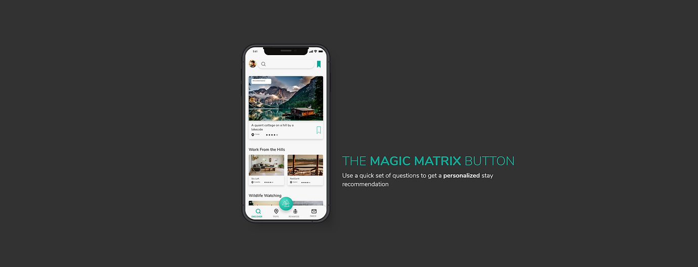
A lot of the information architecture followed conventions, but the magic matrix button was yet to be added. This would be a lot like a floating button and would feature the scape logo.
-
The navigation would use a tabbed view with the conventional bottom navigation bar taking charge. A profile icon would be used to show common settings a well as help and documentation.
-
The rewards section had to be well thought-out because of many possible variables such as types of rewards, locked/unlocked rewards, already redeemed rewards etc.
Checkin' out the Competition
Before starting to materialize the ideas, there was one final step to solidify all the research and actions taken so far. Competitor Analysis with three of Jacob Nielson's usability heuristics used as criteria for measurement:
-
User Control and Freedom
-
Aesthetic and Minimalist Design
-
Match between System and the World
I chose the following competitors because they either directly or indirectly fell into the domain of sustainable travel.

Airbnb: Marketplace vacation rental platform, added experiences as a secondary feature.
4.6 / 5

Kerala Forest Ecotourism: Ecotourism through listings of experiences, stays and products
1.8 / 5

Worldpackers: Time and skills to the host region in exchange for food and accommodation (Win-win)
3.8 / 5
Prototype & Test

Paper Prototype
At the early stage of prototyping, the low fidelity paper prototype was created to test the red-route user flows. The goal of this first usability test was to see users’ reactions towards a new and interesting way to browse stays (Magic matrix button) and to find out if they could figure out the purpose of the app without being explicitly informed about it.
While making personalized travel recommendations, there are a number of things that need to be considered in addition to the typical features such as the travel dates and the number of guests. The manner in which they are presented makes all the difference because of the high number of decisions the user needs to make within a few minutes. The initial hypothesis was that the users would find it tedious to enter more than the required information, making the “magic matrix button” feature redundant.
Guerrilla Usability Test
The chosen location for the test was Cafe Moksh, a cozy cafe with a basic menu (black coffee and maggi, anyone?) that attracts young professionals who spend a large chunk of their time with digital devices. The people approached for the testing were all kind enough to oblige just for being asked nicely. There were four men between 25 and 35 and one woman aged 24- all working professionals. These were the findings from the usability testing sessions.
1
3 out of 5 participants could not identify the idea of eco-friendliness very clearly , even after booking a stay.
Recommendation:
Design the UI and the splash screen to convey the idea of sustainable travel immediately.
2
3 out of 5 participants requested to have more options while selecting preferences (eg: landscapes, amenities etc.)
Recommendations:
Use extremely identifiable and easy to understand terms while formulating questions in the magic matrix flow.
Give more options for preferences wherever possible to increase the sense of control for the users.
3
2 out of 5 participants recognized the results page with the three curated options as the payment gateway.
Recommendations:
Use titles on every page that convey its purpose very clearly (“Results/ Confirmation / Summary etc.)
Design the cards to convey that they are clickable elements


High-Fidelity Prototype
Scape has a very clear purpose and green seemed like the obvious choice for a primary color. To delve deeper, I developed a brand personality and created a mood board to reflect the attributes that truly define this purpose.

To keep up with a minimalist palette for my modern minimalist design, I decided to go with the ocean tones and create a gradient that represents a fresh water lagoon.
style
Modern Minimalist-
Lots of imagery, subtle illustrations, bold typography, rounded edges
typography
Typeface: Nunito
High readability, rounded lettering, neat but informal and friendly.
color palette
Ocean toned gradient, dark and light bases and a grey for disabled states
brand attributes
Convivial, sustainable, inclusive, personal and trustworthy
Outcomes & Lessons
The research interviews revealed that users would be keen on trying out the app knowing that it’s pro-environment. The challenge will be to give them an overall experience so worthy that they return for future bookings.
The victories for each of our stakeholders are:
Planet (Environment): Popularizing sustainable travel and building a community of sensitized travelers
People (Social): Giving employment opportunities to the local communities in the service sector as well as including NGO donations.
Profit (Economic): Booking through the app (service charge) and promoting stays with higher sustainable scores, partnerships for rewards
Feature ideation for future versions:
-
Integrating a travel guide so that the app is useful even after a booking has been made.
-
Creating a separate host app with access to information and government policies that can help them integrate sustainable practices in their stays.
-
A platform for experts and hosts to blog about sustainable travel and reach the right audience.
-
User generated content for travel recommendations.